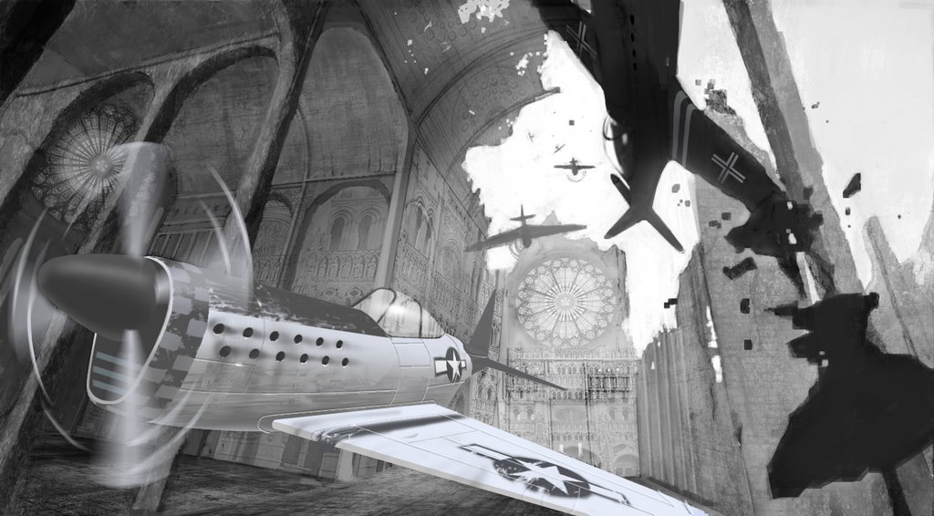
Well I added texture and worked a little more value into this piece. But before i start color do you guys have any suggestions? Keep in mind that there won't be much contrst on the Nazi plane when i add a lighter value explosion later.
My comment would be try not to make textures look like textures blend them into your piece a little better there are a few opportunities on the back walls to really make the textures feel like they are real, manly where the textures meet....if you show that little bit of depth I think the whole picture will really come to life...I'ts looking good man, now just color the thing and call it done.
Hi, Marcus. This is Eduard but I forgot my password. I think this piece is getting better. Now I can feel this is an open space and the rendering is better. Maybe still too flat, especially over the main plane; I feel like I need some accent there. And about the building I recommend you to take it apart (on another sheet of paper without the planes) and construct it trying to fit it into more consistent shapes and interesting proportions. Now it looks like a pattern you use to fill up the background. I mean that all those arches are too similar and too equally dominant. Maybe I have this impression also because the angle we are looking at it is close to an isometric one (the three planes or axis are making the same angle with our view direction). Of course I am exaggerating a lot, but I do that to give you the sense of what I am trying to say. Now, I don't recommend you to change the orientation of the whole background, although it would be an interesting challenge. I think that is sufficient with giving more variety into the shapes, size and rhythm of those arches, maybe bring lower the secondary aisle. Maybe the only problem is that the texture you are using is far too refined and complicated for the simple, basic three dimensional space you put it over and that's what it makes me focus on the background. I mean it looks to me a bit as gothic architecture texture over a primitive Byzantine church space.
Yo thanks for the feedback Eduard I appreciate it I wanna spend more time on this piece but this term at school is giving alot of work i'll keep posting new stuff though.
4 comments:
My comment would be try not to make textures look like textures blend them into your piece a little better there are a few opportunities on the back walls to really make the textures feel like they are real, manly where the textures meet....if you show that little bit of depth I think the whole picture will really come to life...I'ts looking good man, now just color the thing and call it done.
thanks Adam your right. Ill try to finish this as quickly as possible and move on.
Hi, Marcus. This is Eduard but I forgot my password. I think this piece is getting better. Now I can feel this is an open space and the rendering is better. Maybe still too flat, especially over the main plane; I feel like I need some accent there. And about the building I recommend you to take it apart (on another sheet of paper without the planes) and construct it trying to fit it into more consistent shapes and interesting proportions. Now it looks like a pattern you use to fill up the background. I mean that all those arches are too similar and too equally dominant. Maybe I have this impression also because the angle we are looking at it is close to an isometric one (the three planes or axis are making the same angle with our view direction). Of course I am exaggerating a lot, but I do that to give you the sense of what I am trying to say. Now, I don't recommend you to change the orientation of the whole background, although it would be an interesting challenge. I think that is sufficient with giving more variety into the shapes, size and rhythm of those arches, maybe bring lower the secondary aisle. Maybe the only problem is that the texture you are using is far too refined and complicated for the simple, basic three dimensional space you put it over and that's what it makes me focus on the background. I mean it looks to me a bit as gothic architecture texture over a primitive Byzantine church space.
Yo thanks for the feedback Eduard I appreciate it I wanna spend more time on this piece but this term at school is giving alot of work i'll keep posting new stuff though.
Post a Comment